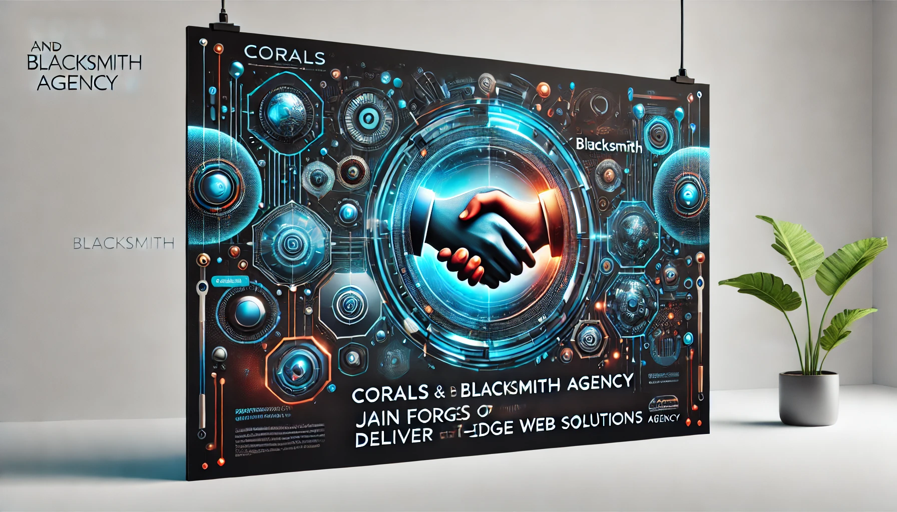
![]() Server : Apache System : Linux server2.corals.io 4.18.0-348.2.1.el8_5.x86_64 #1 SMP Mon Nov 15 09:17:08 EST 2021 x86_64 User : corals ( 1002) PHP Version : 7.4.33 Disable Function : exec,passthru,shell_exec,system Directory : /home/corals/vreg/node_modules/vue-owl-carousel/ |
[](https://www.npmjs.com/package/vue-owl-carousel) --- ## Intro - The [VueJS](https://vuejs.org/) wrapper for [Owl Carousel](https://owlcarousel2.github.io/OwlCarousel2/). - [Owl Carousel](https://owlcarousel2.github.io/OwlCarousel2/) is touch enabled jQuery plugin that lets you create a beautiful responsive carousel slider. - Extended from [vue-owl-carousel](https://github.com/s950329/vue-owl-carousel) ## Installation `npm i -s vue-owl-carousel` or `yarn add vue-owl-carousel` ## Usage ``` <script> import carousel from 'vue-owl-carousel' export default { components: { carousel }, } </script> ``` Basic Usage ``` <carousel> <img src="https://placeimg.com/200/200/any?1"> <img src="https://placeimg.com/200/200/any?2"> <img src="https://placeimg.com/200/200/any?3"> <img src="https://placeimg.com/200/200/any?4"> </carousel> ``` Custom prev and next buttons using slot, the buttons will be hidden while start and end in non-loop mode ``` <carousel> <template slot="prev"><span class="prev">prev</span></template> // <template slot="next"><span class="next">next</span></template> </carousel> ``` Set options, ``` <carousel :autoplay="true" :nav="false"> // </carousel> ``` Set events, ``` <carousel @changed="changed" @updated="updated"> // </carousel> ``` ## Available options Currently following options are available. - ### items type : `number` default : `3` The number of items you want to see on the screen. - ### margin type : `number` default : `0` Margin-right (px) on item. - ### loop type : `boolean` default : `false` Infinity loop. Duplicate last and first items to get loop illusion. - #### center Type: `Boolean` Default: `false` Center item. Works well with even an odd number of items. - #### nav Type: `Boolean` Default: `false` Show next/prev buttons. - #### autoplay Type: `Boolean` Default: `false` Autoplay. - #### autoplaySpeed Type: `Number/Boolean` Default: `false` Autoplay speed. - #### rewind Type: `Boolean` Default: `true` Go backwards when the boundary has reached. - #### mouseDrag Type: `Boolean` Default: `true` Mouse drag enabled. - #### touchDrag Type: `Boolean` Default: `true` Touch drag enabled. - #### pullDrag Type: `Boolean` Default: `true` Stage pull to edge. - #### freeDrag Type: `Boolean` Default: `false` Item pull to edge. - #### stagePadding Type: `Number` Default: `0` Padding left and right on stage (can see neighbours). - #### autoWidth Type: `Boolean` Default: `false` Set non grid content. Try using width style on divs. - #### autoHeight Type: `Boolean` Default: `false` Set non grid content. Try using height style on divs. - #### dots Type: `Boolean` Default: `true` Show dots navigation. - #### autoplayTimeout Type: `Number` Default: `5000` Autoplay interval timeout. - #### autoplayHoverPause Type: `Boolean` Default: `false` Pause on mouse hover. - #### responsive Type: `Object` Default: `{}` Example : `:responsive="{0:{items:1,nav:false},600:{items:3,nav:true}}"` Object containing responsive options. Can be set to false to remove responsive capabilities. ## Available events The trigger timing can see [Owl Carousel document](https://owlcarousel2.github.io/OwlCarousel2/demos/events.html) - initialize - initialized - resize - resized - refresh - refreshed - update - updated - drag - dragged - translate - translated - to - changed ## :collision: NPM [](https://www.npmjs.com/package/vue-owl-carousel)